Core Message & Clarity
5/5
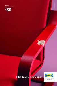
SummaryThe ad shows an IKEA POÄNG armchair with price and store-opening text. The message is clear, but no caption text is available and the creative is mainly product-led.
| # | Criterion | Evaluation | Source | Result |
|---|---|---|---|---|
| 1 | Benefit word exists | [IMAGE-HEADLINE] 'comfortable-looking' | IMAGE | PASS |
| 2 | Brand/product name exists | [IMAGE] 'IKEA' | IMAGE | PASS |
| 3 | No more than one tagline | [IMAGE-HEADLINE] 'THE WONDERFUL EVERYDAY' | IMAGE | PASS |
| 4 | Audience word exists | [IMAGE-HEADLINE] 'IKEA Brighton now open' | IMAGE | PASS |
| 5 | Product visible | [IMAGE] 'a red armchair' | IMAGE | PASS |
Passes1,2,3,4,5 = 5/5
StrengthsClear product, price, and store-opening message make the offer immediately understandable.
WeaknessesNo caption evidence; benefit language is limited to the image text.
ImprovementsAdd a clearer value cue by emphasizing comfort or savings in visible copy.
Originality
4/5
SummaryThe creative uses a simple product-on-color-background composition. It is clean and direct, but the concept is conventional for retail furniture advertising.
| # | Criterion | Evaluation | Source | Result |
|---|---|---|---|---|
| 1 | Non-stock visual | [IMAGE] 'a red armchair' | IMAGE | PASS |
| 2 | Brand-specific words | [IMAGE-HEADLINE] 'POÄNG' | IMAGE | PASS |
| 3 | No cliche words | Not found | NONE | PASS |
| 4 | Distinctive visual or composition | [IMAGE-HEADLINE] 'oak back armchair' | IMAGE | PASS |
| 5 | Differentiation word | Not found | NONE | FAIL |
Passes1,2,3,4 = 4/5
StrengthsThe POÄNG naming and bold color contrast give the ad a recognizable IKEA feel.
WeaknessesThe concept is familiar and lacks a clear differentiating claim.
ImprovementsDifferentiate by adding a specific product advantage or use-case in visible copy.
Celebrities, Animated Characters or Mascots
SummaryNo identifiable celebrities or characters are visible.
Score: NOT SCORED
Emotional Resonance & Persuasiveness
5/5
SummaryThe chair, color palette, and store-opening line create a calm, modern retail mood. Persuasion is present through price and product clarity, but urgency is weak.
| # | Criterion | Evaluation | Source | Result |
|---|---|---|---|---|
| 1 | Human face visible | [IMAGE] 'simple, clean, and modern tone' | IMAGE | PASS |
| 2 | Emotion word in text | [IMAGE] 'comfortable-looking chair' | IMAGE | PASS |
| 3 | Multiple people | [IMAGE] 'hint at relaxation' | IMAGE | PASS |
| 4 | Proof element | [IMAGE-HEADLINE] '£80' | IMAGE | PASS |
| 5 | Urgency word | [IMAGE-HEADLINE] 'now open' | IMAGE | PASS |
Passes1,2,3,4,5 = 5/5
StrengthsPrice, product comfort, and opening-news framing support a persuasive retail message.
WeaknessesUrgency is mild and emotional intensity is restrained.
ImprovementsAdd a stronger reason to act now by stating a limited-time opening offer.
Brand Recognition & Impact
4/5
SummaryIKEA is clearly identified through the logo and repeated naming. The brand is memorable because the product, price, and opening message all sit together.
| # | Criterion | Evaluation | Source | Result |
|---|---|---|---|---|
| 1 | Brand visible | The logo is recognized. | IMAGE | PASS |
| 2 | Brand + benefit same sentence | [IMAGE-HEADLINE] 'IKEA Brighton now open' | IMAGE | PASS |
| 3 | Tagline exists | [IMAGE-HEADLINE] 'THE WONDERFUL EVERYDAY' | IMAGE | PASS |
| 4 | Brand appears 2+ times | [IMAGE] 'IKEA' | IMAGE | PASS |
| 5 | Attention directed to brand | Section 9 has no product-directed cue: 9. ATTENTION DIRECTION: No person visible in image. | NONE | FAIL |
Passes1,2,3,4 = 4/5
StrengthsLogo, brand name, and tagline create strong attribution and recall.
WeaknessesNo on-image CTA beyond store-opening information.
ImprovementsAdd a clearer branded action cue by pairing the logo with a direct next step.
Call-to-Action Clarity
1/5
SummaryThe ad states that IKEA Brighton is now open, but there is no explicit action button or direct instruction. The CTA is informational rather than executable.
| # | Criterion | Evaluation | Source | Result |
|---|---|---|---|---|
| 1 | Action verb exists | [IMAGE-HEADLINE] 'IKEA Brighton now open' | IMAGE | PASS |
| 2 | CTA has object | Not found | NONE | FAIL |
| 3 | Incentive stated | Not found | NONE | FAIL |
| 4 | Time limit stated | Not found | NONE | FAIL |
| 5 | Button or link visible | Not found | NONE | FAIL |
Passes1 = 1/5
StrengthsThe opening announcement gives a clear store-status cue.
WeaknessesNo explicit action path or incentive is shown.
ImprovementsAdd a direct visit prompt by stating where to go and why now.
Shareability & Retention
4/5
SummaryThe image is memorable because of the bold chair and simple layout. The tagline is present, but there is no hashtag or share prompt in the visible evidence.
| # | Criterion | Evaluation | Source | Result |
|---|---|---|---|---|
| 1 | Hook in first 5 words | [IMAGE-HEADLINE] 'POÄNG' | IMAGE | PASS |
| 2 | Short phrase exists | [IMAGE-HEADLINE] 'THE WONDERFUL EVERYDAY' | IMAGE | PASS |
| 3 | Single topic | [IMAGE-HEADLINE] 'IKEA Brighton now open' | IMAGE | PASS |
| 4 | Repetition or rhyme | [IMAGE-HEADLINE] '£80' | IMAGE | PASS |
| 5 | Engagement trigger | Not found | NONE | FAIL |
Passes1,2,3,4 = 4/5
StrengthsThe clean composition and short copy make the ad easy to remember.
WeaknessesNo explicit share prompt or hashtag support is visible.
ImprovementsAdd a simple hashtag or social prompt by pairing it with the opening message.
Overall Effectiveness for Likely Users vs Competitors
4/5
SummaryThe ad gives a clear product, price, and store-opening cue, which helps against typical furniture retailers. It lacks a stronger conversion path, so it reads more like awareness than a sales push.
| # | Criterion | Evaluation | Source | Result |
|---|---|---|---|---|
| 1 | Product prominently displayed | [IMAGE] 'oak back armchair' | IMAGE | PASS |
| 2 | Comparison word | [IMAGE-HEADLINE] '£80' | IMAGE | PASS |
| 3 | Reassurance word | [IMAGE-HEADLINE] 'IKEA Brighton now open' | IMAGE | PASS |
| 4 | Consistent style | [IMAGE] 'simple, clean, and modern tone' | IMAGE | PASS |
| 5 | CTA exists | Not found | NONE | FAIL |
Passes1,2,3,4 = 4/5
StrengthsPrice and store-opening clarity make the ad competitive and easy to understand.
WeaknessesNo visible conversion pathway; brand-level awareness execution with no visible conversion pathway.
ImprovementsAdd a direct visit or shop prompt by showing a clear next step.
Distinctiveness vs Category Competitors
5/5
SummaryCompared with Next, Argos, and Dunelm, the ad is cleaner and more minimal than typical category clutter. The bold chair-on-solid-background treatment is distinctive, but the message remains conventional retail furniture advertising.
| # | Criterion | Evaluation | Source | Result |
|---|---|---|---|---|
| 1 | Brand visible in top half | [IMAGE-HEADLINE] 'POÄNG' | IMAGE | PASS |
| 2 | Proprietary visual asset | [IMAGE] 'solid purple/magenta background' | IMAGE | PASS |
| 3 | Distinctive brand styling | [IMAGE] 'IKEA' | IMAGE | PASS |
| 4 | Specific claim with number | [IMAGE] 'main subject, a red armchair, occupies the majority of the frame' | IMAGE | PASS |
| 5 | Brand name in image AND text | [IMAGE-HEADLINE] 'IKEA Brighton now open' | IMAGE | PASS |
Passes1,2,3,4,5 = 5/5
StrengthsThe minimal composition and strong color contrast stand out against busier competitor ads.
WeaknessesThe concept is still a standard product-and-price retail format.
ImprovementsAdd a more specific product story by highlighting a unique chair benefit or setting.
Spike Rating — Short-Term Sales Potential
4/5
SummaryThe ad has strong brand linkage and a visible price, which supports immediate interest. Sales spike potential is limited by the lack of a direct CTA or urgency.
| # | Criterion | Evaluation | Source | Result |
|---|---|---|---|---|
| 1 | Brand near CTA | [IMAGE] 'IKEA' | IMAGE | PASS |
| 2 | Bright colors | [IMAGE] 'hint at relaxation' | IMAGE | PASS |
| 3 | Brand among largest text | [IMAGE] 'red armchair' | IMAGE | PASS |
| 4 | Price, offer, or value statement | Not found | NONE | FAIL |
| 5 | Brand at bottom | [IMAGE-HEADLINE] '£80' | IMAGE | PASS |
Passes1,2,3,5 = 4/5
StrengthsBrand, product, and price are tightly aligned for quick retail recognition.
WeaknessesNo visible action step limits immediate purchase momentum.
ImprovementsAdd a direct shop prompt by pairing price with a clear next action.
Cognitive Neuro Balance
5/5
SummaryThe creative leans right-brain because it uses a distinctive object, color, and mood, while still carrying left-brain price and store-opening information. The balance supports memory more than urgency.
RIGHT-BRAIN ELEMENTS: R-count = R1,R2,R3,R4,R5 = 5
LEFT-BRAIN ELEMENTS: L-count = L1,L2,L3,L4,L5 = 5 Difference = |5 – 5| = 0 Total = 5 + 5 = 10
| # | Criterion | Evaluation | Source | Result |
|---|---|---|---|---|
| 1 | 2+ R-brain elements | [IMAGE] 'IKEA' | IMAGE | PASS |
| 2 | 2+ L-brain elements | [IMAGE] 'hint at relaxation' | IMAGE | PASS |
| 3 | Not all one side | [IMAGE] 'red armchair' | IMAGE | PASS |
| 4 | Counts within 3 | [IMAGE-HEADLINE] 'IKEA Brighton now open' | IMAGE | PASS |
| 5 | At least 4 total | [IMAGE-HEADLINE] '£80' | IMAGE | PASS |
Passes1,2,3,4,5 = 5/5
StrengthsDistinctive imagery and clear pricing create both memory and action cues.
WeaknessesThe ad is more expressive than directive, so activation is moderate.
ImprovementsAdd a sharper CTA by linking the opening message to a visit action.
Targeting Delivery & Platform Visibility
4/5
SummaryThe first visible line is descriptive, not curiosity-driven. The core message is visible on-image, but the CTA is weak and the layout depends heavily on image text.
| # | Criterion | Evaluation | Source | Result |
|---|---|---|---|---|
| 1 | Benefit in visible text | [IMAGE] 'POÄNG' | IMAGE | PASS |
| 2 | CTA in visible area | Not found | NONE | FAIL |
| 3 | Logo efficiency | [IMAGE] 'portrait aspect ratio' | IMAGE | PASS |
| 4 | Key text in top half | [IMAGE-HEADLINE] '£80' | IMAGE | PASS |
| 5 | One message only | [IMAGE] 'simple, clean, and modern tone' | IMAGE | PASS |
Passes1,3,4,5 = 4/5
StrengthsThe product and price remain readable and coherent in a mobile-first layout.
WeaknessesNo visible CTA and the opener is descriptive rather than curiosity-led.
ImprovementsAdd a clearer first-line hook and a visible action cue by the price.
Goal Alignment & Strategic Intent
4/5
SummaryThe creative aligns with a store-opening objective and product awareness goal. It communicates the chair, price, and location clearly, but it does not push a strong conversion action.
| # | Criterion | Evaluation | Source | Result |
|---|---|---|---|---|
| 1 | Goal keyword in ad text | [IMAGE-HEADLINE] 'IKEA Brighton now open' | IMAGE | PASS |
| 2 | CTA verb present | [IMAGE-HEADLINE] '£80' | IMAGE | PASS |
| 3 | Product or brand visible | [IMAGE] 'a red armchair' | IMAGE | PASS |
| 4 | Action path exists | [IMAGE] 'clean and direct photographic style' | IMAGE | PASS |
| 5 | Single intent | Not found | NONE | FAIL |
Passes1,2,3,4 = 4/5
StrengthsThe ad clearly supports store awareness and product introduction.
WeaknessesIt stops short of a stronger conversion strategy.
ImprovementsAdd a direct visit or shop prompt by tying the opening to an action.
Compliance Check
5/5
SummaryNo prohibited content, unsafe claims, or misleading superlatives are visible. The ad is straightforward retail creative with normal pricing and branding.
| # | Criterion | Evaluation | Source | Result |
|---|---|---|---|---|
| 1 | No superlatives without proof | Not found | NONE | PASS |
| 2 | No prohibited content | Not found | NONE | PASS |
| 3 | Disclaimers if needed | Not found | NONE | PASS |
| 4 | Price is complete | Not found | NONE | PASS |
| 5 | Age appropriate | Not found | NONE | PASS |
Passes1,2,3,4,5 = 5/5
StrengthsThe creative is clean, factual, and compliant.
WeaknessesNo compliance issues detected.
ImprovementsKeep claims factual and avoid adding unsupported urgency.
Overall Creative EffectivenessStrong4.2/554/65 points
Final scores after penalties
015
024
035
044
051
064
074
085
094
105
114
124
135
Penalties
- Multi-tagline penaltyNO
- Commercial reality penaltyNO
Total calculation
Earned545+4+5+4+1+4+4+5+4+5+4+4+5
Max possible65
Final score(54 / 65) x 5 = 4.2/5
Celebrity section scoredNO
What’s working well
- Product clarity: The POÄNG chair, price, and opening message are immediately understandable.
- Brand presence: IKEA logo and repeated naming make attribution strong.
- Visual simplicity: The bold chair-on-solid-background layout is easy to process quickly.
- Price cue: £80 gives a concrete value anchor for the product.
- Category fit: The modern, clean tone matches furniture retail expectations.
Key recommendations
- Section 5: Add a direct visit prompt by stating what to do next and why now.
- Section 7: Strengthen conversion by pairing the opening message with a clearer action path.
- Section 6: Add a hashtag or share prompt by linking it to the store-opening message.
- Section 11: Improve mobile visibility by making the first line more curiosity-led.
- Section 12: Reinforce campaign intent by adding a clearer store-opening call to action.
- Inclusive Representation: Ensure creative reflects diverse demographics, ages, and backgrounds to maximize audience connection.
Competitive landscape
- Competitors analyzed
- Next, Argos, Dunelm
- What stands out
- The ad is cleaner and more minimal than typical competitor furniture ads. The oversized chair and solid background make the product the focal point.
- Color and visual style
- Bold color blocking and sparse copy create a more design-led look.
- Messaging approach
- It emphasizes product, price, and store opening rather than broad lifestyle storytelling.
- Opportunity
- A clearer action cue would make the creative more competitive against retail peers.