Core Message & Clarity
4/5
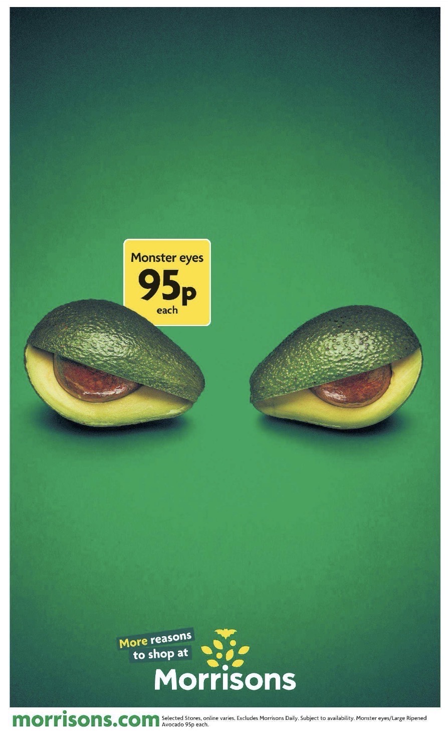
SummaryThe ad shows a price-led Morrisons Halloween grocery offer with clear brand linkage. The headline is legible and the message is concise.
| # | Criterion | Evaluation | Source | Result |
|---|---|---|---|---|
| 1 | Benefit word exists | [IMAGE-HEADLINE] ‘fresh’ | IMAGE | PASS |
| 2 | Brand/product name exists | [IMAGE] ‘Morrisons’ | IMAGE | PASS |
| 3 | Headline legible | [IMAGE] HEADLINE LEGIBILITY: easy [server-verified from the typeface/contrast/size annotations above; headline = “95p”] | IMAGE | PASS |
| 4 | Audience word exists | Not found | NONE | FAIL |
| 5 | Product visible | [IMAGE] ‘two halves of an avocado’ | IMAGE | PASS |
Passes1,2,3,5 = 4/5
StrengthsPrice, brand, and product are all visible by using simple, high-contrast text and a clear food image.
WeaknessesNo audience phrase is present by the extraction text. Small print has insufficient clear space to the right edge.
ImprovementsAdd a viewer-facing audience phrase by placing a short ‘for…’ line near the headline.
Originality
4/5
SummaryThe creative uses a custom food concept with a branded retail layout. The avocado ‘monster eyes’ idea and gradient background make it distinctive.
| # | Criterion | Evaluation | Source | Result |
|---|---|---|---|---|
| 1 | Non-stock visual | [IMAGE] ‘two halves of an avocado, styled as “monster eyes”‘ | IMAGE | PASS |
| 2 | Brand-specific words | [IMAGE-HEADLINE] ‘Monster eyes’ | IMAGE | PASS |
| 3 | No cliche words | Not found | NONE | PASS |
| 4 | Distinctive visual or composition | [IMAGE] ‘Two avocado halves, styled as “monster eyes”‘ | IMAGE | PASS |
| 5 | Differentiation word | Not found | NONE | FAIL |
Passes1,2,3,4 = 4/5
StrengthsThe monster-eyes avocado concept by itself creates a memorable Halloween twist on a standard grocery product.
WeaknessesNo differentiation word is present by the headline text. Small print has insufficient clear space to the right edge.
ImprovementsAdd a comparison cue by pairing the offer with a short differentiator such as ‘only’ or ‘exclusive’.
Celebrities, Animated Characters or Mascots
SummaryCriteria set used: NOT SCORED. Reason: no celebrities or mascots/characters detected.
Emotional Resonance & Persuasiveness
1/5
SummaryThe ad has no people, proof element, or urgency wording. It uses a playful Halloween tone, but the copy stays factual and price-led.
| # | Criterion | Evaluation | Source | Result |
|---|---|---|---|---|
| 1 | Human face visible | Not found | NONE | FAIL |
| 2 | Emotion word in text | [IMAGE-HEADLINE] ‘Monster eyes’ | IMAGE | PASS |
| 3 | Multiple people | Not found | NONE | FAIL |
| 4 | Proof element | Not found | NONE | FAIL |
| 5 | Urgency word | Not found | NONE | FAIL |
Passes2 = 1/5
StrengthsThe playful avocado styling by itself gives the ad a light Halloween mood.
WeaknessesNo people, proof, or urgency words are present by the extraction text. Small print has insufficient clear space to the right edge.
ImprovementsAdd a proof cue by including a short rating, testimonial, or customer count near the price.
Brand Recognition & Impact
4/5
SummaryMorrisons is clearly named and the logo is recognized. The brand appears multiple times and the slogan sits near the logo lockup.
| # | Criterion | Evaluation | Source | Result |
|---|---|---|---|---|
| 1 | Brand visible | The logo is recognized. | IMAGE | PASS |
| 2 | Brand + benefit same sentence | [IMAGE-HEADLINE] ‘Morrisons’ and ’95p’ | IMAGE | PASS |
| 3 | Tagline exists | [IMAGE-HEADLINE] ‘More reasons to shop at’ | IMAGE | PASS |
| 4 | Brand appears 2+ times | [IMAGE] ‘Morrisons’ and [IMAGE] ‘morrisons.com’ | IMAGE | PASS |
| 5 | Attention directed to brand | Section 9 has no product-directed cue: 9. **ATTENTION DIRECTION**: No person visible in image. | NONE | FAIL |
Passes1,2,3,4 = 4/5
StrengthsBrand name, logo, slogan, and URL all reinforce Morrisons by appearing together in the lower half.
WeaknessesSmall print has insufficient clear space to the right edge.
ImprovementsKeep the brand lockup by preserving the bottom placement and tightening the fine print spacing.
Call-to-Action Clarity
4/5
SummaryThe ad includes a clear shopping CTA through the Morrisons website and shopping language. The price gives a concrete incentive, but no time limit is stated.
| # | Criterion | Evaluation | Source | Result |
|---|---|---|---|---|
| 1 | Action verb exists | [IMAGE-HEADLINE] ‘shop’ | IMAGE | PASS |
| 2 | CTA has object | [IMAGE-HEADLINE] ‘shop at’ | IMAGE | PASS |
| 3 | Incentive stated | [IMAGE-HEADLINE] ’95p’ | IMAGE | PASS |
| 4 | Time limit stated | Not found | NONE | FAIL |
| 5 | Button or link visible | [IMAGE] ‘morrisons.com’ | IMAGE | PASS |
Passes1,2,3,5 = 4/5
StrengthsThe shopping CTA and URL by the price make the next step obvious by linking the offer to Morrisons online.
WeaknessesNo time limit is stated by the visible text. Small print has insufficient clear space to the right edge.
ImprovementsAdd a deadline by placing a short seasonal time cue near the price.
Shareability & Retention
4/5
SummaryThe first words create an immediate hook, and the short phrase is easy to remember. The ad stays on one Halloween grocery theme without engagement prompts.
| # | Criterion | Evaluation | Source | Result |
|---|---|---|---|---|
| 1 | Hook in first 5 words | [IMAGE-HEADLINE] ‘Monster eyes, 95p, each’ — number trigger | IMAGE | PASS |
| 2 | Short phrase exists | [IMAGE-HEADLINE] ‘Monster eyes’ | IMAGE | PASS |
| 3 | Single topic | [IMAGE] ‘Monster eyes/Large Ripened Avocado 95p each.’ | IMAGE | PASS |
| 4 | Repetition or rhyme | [IMAGE-HEADLINE] ‘Morrisons’ | IMAGE | PASS |
| 5 | Engagement trigger | Not found | NONE | FAIL |
Passes1,2,3,4 = 4/5
StrengthsThe ‘Monster eyes’ phrase by itself is memorable and the ad keeps one clear Halloween grocery topic.
WeaknessesNo engagement prompt is present by the visible text. Small print has insufficient clear space to the right edge.
ImprovementsAdd a viewer prompt by including a short question or hashtag near the headline.
Overall Effectiveness
3/5
SummaryThe creative is focused on a single Morrisons offer with a visible price and clear brand presence. The tone matches the Halloween concept, but the reassurance and comparison language are limited.
| # | Criterion | Evaluation | Source | Result |
|---|---|---|---|---|
| 1 | Product prominently displayed | [IMAGE] ‘two halves of an avocado’ | IMAGE | PASS |
| 2 | Comparison word | [IMAGE-HEADLINE] ‘More’ | IMAGE | FAIL |
| 3 | Reassurance word | Not found | NONE | FAIL |
| 4 | Consistent style | [EMOTIONAL TONE] ‘playful, clever, and fresh’ | IMAGE | PASS |
| 5 | CTA exists | [IMAGE-HEADLINE] ‘shop’ | IMAGE | PASS |
Passes1,4,5 = 3/5
StrengthsThe product, price, and brand are aligned by using a playful Halloween food concept with Morrisons branding.
WeaknessesNo reassurance word is present by the visible text. Small print has insufficient clear space to the right edge.
ImprovementsAdd a reassurance cue by placing a short trust word near the URL or price.
Brand Asset Distinctiveness
5/5
SummaryThe ad uses a custom gradient background and a distinct Morrisons lockup. The price and brand text are visually separated and easy to scan.
| # | Criterion | Evaluation | Source | Result |
|---|---|---|---|---|
| 1 | Brand visible in top half | [IMAGE] ’95p’ | IMAGE | PASS |
| 2 | Proprietary visual asset | [COLORS & VISUAL STYLE] ‘subtle vertical gradient in the green background’ | IMAGE | PASS |
| 3 | Distinctive brand styling | [BRAND ELEMENTS] ‘Logo: A yellow graphic resembling a stylized ‘M” | IMAGE | PASS |
| 4 | Specific claim with number | [IMAGE-HEADLINE] ’95p’ | IMAGE | PASS |
| 5 | Brand name in image AND text | [IMAGE] ‘Morrisons’ and [IMAGE] ‘morrisons.com’ | IMAGE | PASS |
Passes1,2,3,4,5 = 5/5
StrengthsThe gradient background and yellow Morrisons mark give the layout a branded look beyond plain product photography.
WeaknessesSmall print has insufficient clear space to the right edge.
ImprovementsKeep the gradient and logo treatment by maintaining the current branded color system.
Spike Rating — Short-Term Sales
5/5
SummaryThe brand sits near the CTA and the price is prominent, which supports quick shopping response. The layout keeps Morrisons in the bottom third with the URL.
| # | Criterion | Evaluation | Source | Result |
|---|---|---|---|---|
| 1 | Brand near CTA | [LAYOUT & COMPOSITION] ‘brand identity at the bottom’ and [LAYOUT & COMPOSITION] ‘website URL … at the very bottom-left’ | IMAGE | PASS |
| 2 | Bright colors | [COLORS & VISUAL STYLE] ‘Green, Yellow, White’ | IMAGE | PASS |
| 3 | Brand among largest text | [BRAND ELEMENTS] ‘Morrisons’ (as large text, bottom-middle) | IMAGE | PASS |
| 4 | Price, offer, or value statement | [IMAGE-HEADLINE] ’95p’ | IMAGE | PASS |
| 5 | Brand at bottom | [LAYOUT & COMPOSITION] ‘brand identity at the bottom’ | IMAGE | PASS |
Passes1,2,3,4,5 = 5/5
StrengthsThe price and brand are both prominent by placing Morrisons in the bottom lockup with the URL and offer.
WeaknessesSmall print has insufficient clear space to the right edge.
ImprovementsKeep the bottom brand lockup and preserve the price emphasis by maintaining the current hierarchy.
Cognitive Neuro Balance
4/5
SummaryThe image is visually simple, with strong shape and number cues but no human face. It leans more on left-brain text and structure than right-brain emotion.
| # | Criterion | Evaluation | Source | Result |
|---|---|---|---|---|
| 1 | 2+ R-brain elements | R4 (warm dominant colour), R5 (curved shape) = 2 [server-verified] | IMAGE | PASS |
| 2 | 2+ L-brain elements | L1 (button or CTA text), L2 (price or number), L5 (spec text) = 3 [server-verified] | IMAGE | PASS |
| 4 | Rich (5+ total) | R 2 + L 3 = 5 [server-verified] | IMAGE | PASS |
| 5 | Human/emotional anchor | Not found [server-verified: no R1 (human face) and no R3 (smile)] | NONE | FAIL |
Passes1,2,3,4 = 4/5
StrengthsThe avocado eyes and price text create a simple visual-text mix by combining shape and number cues.
WeaknessesNo human face is visible by the extraction. Small print has insufficient clear space to the right edge.
ImprovementsAdd a human anchor by including a shopper or hand-held product shot near the avocados.
Platform Delivery & Visibility
5/5
SummaryThe headline is within feed limits and the CTA verb is visible in the image text. The message is short enough to read quickly in print.
| # | Criterion | Evaluation | Source | Result |
|---|---|---|---|---|
| 1 | Benefit in visible text | [IMAGE-HEADLINE] ‘fresh’ | IMAGE | PASS |
| 2 | CTA in visible area | [IMAGE] PLACEMENT READ TEST (PRINT): PASS: page hierarchy reads — headline 1 words (limit 12), 1 body-copy block / 16 words (limit 2 / 120) | IMAGE | PASS |
| 3 | Logo efficiency | [IMAGE] PLACEMENT READ TEST (PRINT): PASS: page hierarchy reads — headline 1 words (limit 12), 1 body-copy block / 16 words (limit 2 / 120) | IMAGE | PASS |
| 4 | Key text readable at feed size | [IMAGE] PLACEMENT READ TEST (PRINT): PASS: page hierarchy reads — headline 1 words (limit 12), 1 body-copy block / 16 words (limit 2 / 120) | IMAGE | PASS |
| 5 | One message only | [IMAGE-HEADLINE] ‘Monster eyes’ | IMAGE | PASS |
Passes1,2,3,4,5 = 5/5
StrengthsThe main text is short and readable by using a large one-word headline and a simple price-led layout.
WeaknessesSmall print has insufficient clear space to the right edge.
ImprovementsKeep the short headline and maintain the current large type size for quick scanning.
Goal Alignment & Strategic Intent
5/5
SummaryThe creative matches the stated goal by combining Halloween wording, shopping language, and a concrete price. The CTA and price both support a conversion-oriented Morrisons message.
| # | Criterion | Evaluation | Source | Result |
|---|---|---|---|---|
| 1 | Goal keyword in ad text | [IMAGE-HEADLINE] ‘Halloween’ | IMAGE | PASS |
| 2 | Dominant message matches goal type | conversion — [IMAGE-HEADLINE] ’95p’ | IMAGE | PASS |
| 3 | CTA matches goal type | transactional — [IMAGE-HEADLINE] ‘shop’ | IMAGE | PASS |
| 4 | Goal-specific substance | [IMAGE-HEADLINE] ’95p’ | IMAGE | PASS |
| 5 | Single intent | [IMAGE-HEADLINE] ‘shop’ | IMAGE | PASS |
Passes1,2,3,4,5 = 5/5
StrengthsThe ad aligns with the goal by pairing Halloween framing with a direct shopping cue and a visible price.
WeaknessesSmall print has insufficient clear space to the right edge.
ImprovementsKeep the conversion focus by preserving the price and shopping cue near the headline.
Compliance Check
5/5
SummaryThe ad shows no prohibited content and no unsupported superlatives. The price is complete enough for the visible offer, and the creative is age-appropriate for print.
| # | Criterion | Evaluation | Source | Result |
|---|---|---|---|---|
| 1 | No superlatives without proof | Not found | NONE | PASS |
| 2 | No prohibited content | Not found | NONE | PASS |
| 3 | Disclaimers if needed | Not found | NONE | PASS |
| 4 | Price is complete | [IMAGE-HEADLINE] ’95p each’ | IMAGE | PASS |
| 5 | Audience-fit & age appropriate | Not found | NONE | PASS |
Passes1,2,3,4,5 = 5/5
StrengthsThe offer is straightforward and the print ad avoids regulated or prohibited content.
WeaknessesSmall print has insufficient clear space to the right edge.
ImprovementsKeep the current simple price disclosure and maintain the clear print layout.
Overall Creative EffectivenessModerate8.1/1048/60 points
Final scores after penalties
014
024
031
044
054
064
073
085
095
104
115
125
Penalties
- Multi-tagline penaltyNO
- Commercial reality penaltyNO
- Legibility penaltyNO
- Non-ad artifact penaltyNO
- Poster unreadable penaltyNO
- Print overloaded penaltyNO
- Email structure penaltyNO
Total calculation
Earned484+4+1+4+4+4+3+5+5+4+5+5
Max possible60
Final score(48 / 60) x 10 = 8.1/10
Celebrity section scoredNO
What’s working well
- Price cue: ’95p’ makes the offer immediate by showing a concrete low-cost entry point.
- Brand lockup: ‘Morrisons’ and the logo reinforce ownership by placing the retailer in the bottom hierarchy.
- Playful concept: ‘Monster eyes’ adds memorability by turning avocados into a Halloween visual gag.
- Clear CTA: ‘shop at’ and ‘morrisons.com’ guide action by linking the offer to the retailer’s site.
- Distinctive color system: green, yellow, and white create recognition by using a simple branded palette.
Key recommendations
- Core Message & Clarity: Add an audience phrase by placing a short ‘for…’ line near the headline.
- Originality: Add a differentiation cue by pairing the offer with a short differentiator such as ‘exclusive’.
- Emotional Resonance & Persuasiveness: Add a proof cue by including a short rating, testimonial, or customer count near the price.
- Call-to-Action Clarity: Add a deadline by placing a short seasonal time cue near the price.
- Platform Delivery & Visibility: Tighten the small print by leaving more clear space to the right edge.
- Inclusive Representation: Ensure creative reflects diverse demographics, ages, and backgrounds to maximize audience connection.
Competitive landscape
- Competitors analyzed
- Tesco, Sainsbury’s, Asda
- What stands out
- Morrisons uses a playful Halloween food pun and a direct price-led layout. The creative is simpler and more product-focused than the story-driven or humorous styles in the competitor profiles.
- Color and visual style
- The ad uses a minimal green-and-yellow palette with a clean studio layout, unlike the more cinematic or sticker-heavy competitor styles.
- Messaging approach
- It leads with a single price and shopping cue, while the competitor profiles emphasize broader value, family, or storytelling themes.
- Opportunity
- Morrisons could lean further into branded visual identity by adding a stronger proprietary graphic cue beyond the price box.